John Yurchak, APSA
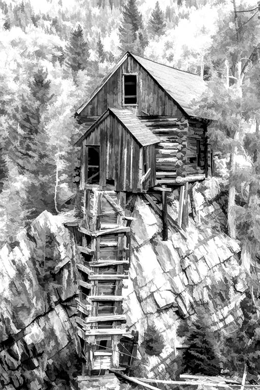
October 2017 - Crystal Mill Powerhouse
Original
About the Image(s)
Color capture in raw and the Canon Camera Raw to use exposure, contrast, darken highlights, lighten shadows, Clarity which does sharpen, and vibrance. Then to CS6 to levels the color photo and if needed some brightness. Merge visible then to smart sharpen. Crop to my value if needed, the to Topaz Labs for detail preset, then to B/W Effect 2 of Topaz. Make image size to 18X 22 for large printing and resolution of 300ppi/dpi.
This round’s discussion is now closed!
11 comments posted
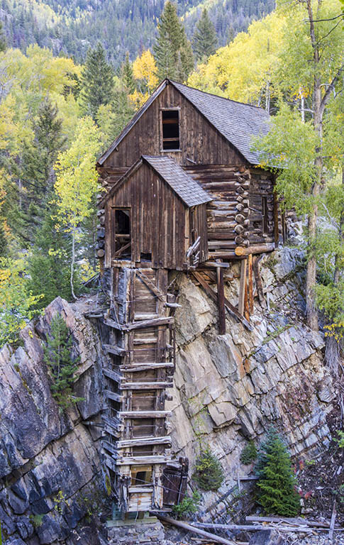
John, this is an extraordinary picture. I'm really wondering where you found the cabin.
The B&W conversion makes it almost appear to be an infrared photo. Amazing. Posted: 10/09/2017 19:59:42
The B&W conversion makes it almost appear to be an infrared photo. Amazing. Posted: 10/09/2017 19:59:42
I rather think the switch to a monochrome was an experiment and one should always experiment to find that which appeals, but in this case John I do prefer the colour original, the tones are so soft and appealing , but it might too benefit from a boost in saturation to liven it a little--just another way of looking at it. The composition is lovely. Posted: 10/12/2017 09:44:03
Two excellent photographs, but like Barbara I do prefer the original. In your conversion to B&W you have lost some great texture in the roof of the cabin as well as the rocks supporting the cabin. The yellow foliage of the trees have become burned out and a bit distracting. I do feel you are on the right track because old wooden structures do lend themselves to B&W which will highlight the texture of the wood. Posted: 10/13/2017 08:49:51
John, I took the liberty of playing with your original image and converting it to B&W using NIK's Silver Efex Pro 2 filter. In doing this I kept the contrast fairly and also gave the image a slight tint. What do you think? Posted: 10/13/2017 10:21:18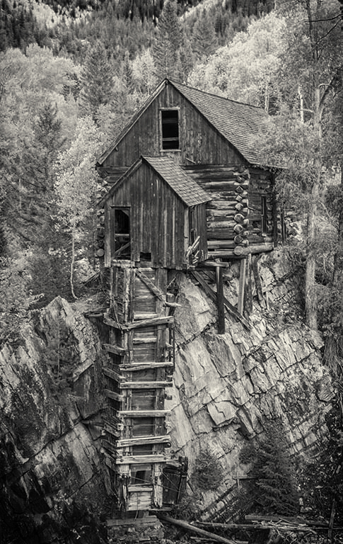
Yes Oliver I like this version VERY much, you have brought out so much texture in the building and that which it sits upon--with just Nik's silver efex pro? But I still lean to the orig. Posted: 10/13/2017 10:27:45
Thank you, Barbara. The changes were almost exclusively with NIK's Silver Efex Pro. But, like you, I prefer the original since the yellow trees add so much to the image. Posted: 10/13/2017 11:00:55
Okay, I couldn't resist putting a little color back in it. What do you think?
Posted: 10/13/2017 11:12:41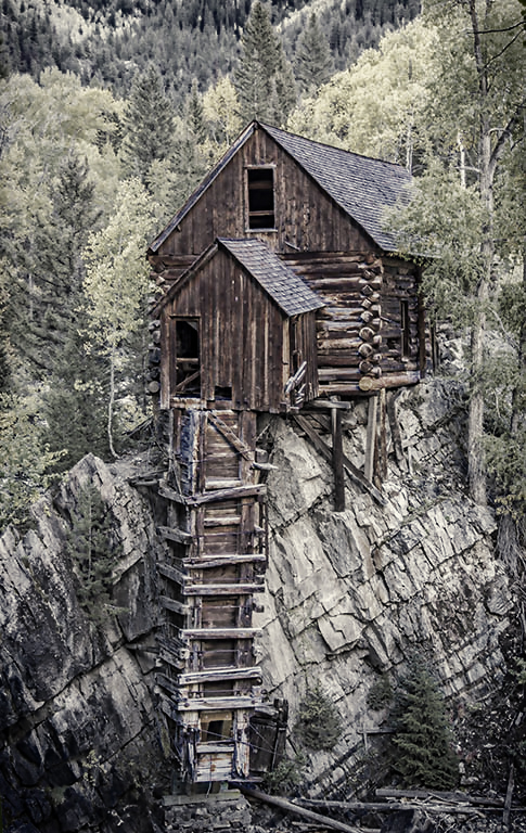
Posted: 10/13/2017 11:12:41
Actually Oliver, it is quite lovely with the little colour brought back, but of the three I still prefer the original. Posted: 10/15/2017 18:31:21
I also like the color version over the mono. The mono treatment seems to blend all the elements together. Adding the right amount of contrast may help. Posted: 10/15/2017 14:47:39
Potentially, I think this is an interesting image, John, but, as you presented it, the house and stairs get rather lost in the complex background. I think Oliver's monochrome image sorts out this problem, though. I can't make my mind up as to which of Oliver's versions I prefer. On balance though I feel the monochrome one is better. In this case the colour detracts slightly from the strong patterns in the image. Posted: 10/24/2017 01:59:38
In reply to my photo of the Crystal mill I made a large B/W print of 12X16 to show at my Artist Guild meeting and many liked what I was showing them as the print for me makes for a better photo and the detail is not lost in it. I find that my print show up better in my large sizes than what shows up on the monitor screen. I am a former darkroom photographer and like something to hold in my hand for my work. Posted: 10/26/2017 17:03:02