Ken Carlson, GPSA
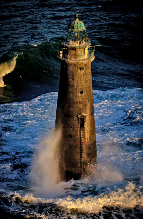
February 2017 - Minot Light # 3
Original
About the Image(s)
This image was taken from a small plane in the late afternoon sun following an offshore storm. I did the initial work in lightroom including increasing the shadow slider to +100, increased the white a little and blacks a little, increased saturation +37, clarity +41 and dehaze + 41. I then cropped it to portrait mode and was not happy with the shadows so I opened the image in Photoshop as a smart object then worked on the shadows in shadows/ highlights.
This round’s discussion is now closed!
9 comments posted
I would lighten the shadow on the left side of the lighthouse so it is the main object of the picture. It will stand out more and really catch the eye of the viewer. The yellow wave crest on the left I would also be lightened a little. Otherwise I think it is a great picture. Posted: 02/04/2017 10:00:59
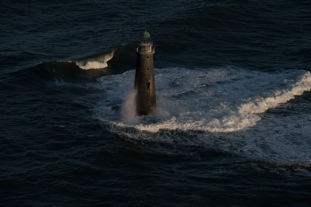
The LH wave in the original is interesting so that I feel its cutoff in the submitted image is a pity. Although the lighthouse demands a vertical image I find the waves appealing that I would like to see this as a horizontal--or perhaps even better as a square. The golden lighting you produced on the lighthouse is lovely. Posted: 02/04/2017 14:01:24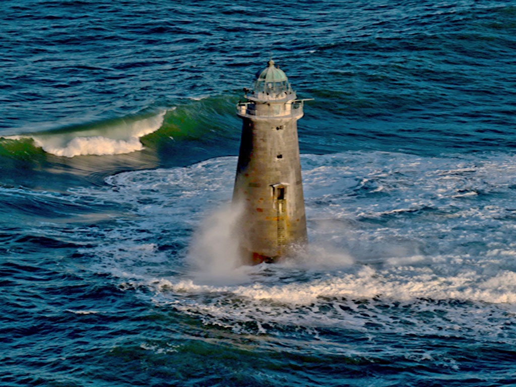
On further reflection Ken I tried flipping it L to R to lead the wave into the frame Posted: 02/05/2017 05:11:11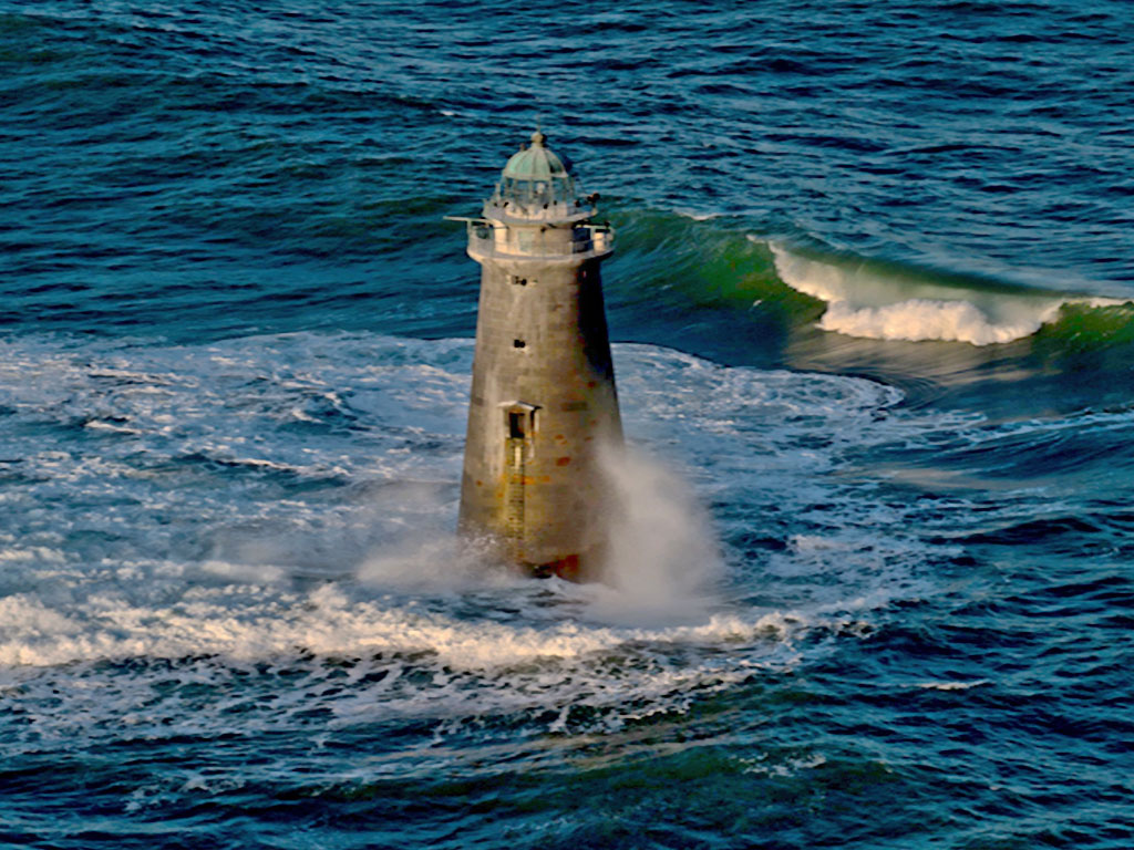
I personally like the format that you have chosen for your photo and the extra glow of light on the lighthouse really helps in the photo. Yes more of the wave on the left might work but it takes away from the subject of the lighthouse. Well done photo Posted: 02/16/2017 15:39:37
Thanks John Posted: 02/19/2017 12:27:09
the vertical composition for this photo is OK with me. I would like to see the white wave in upper left take on some blue and made a little darker so as not to take away from the lighthouse. I might also add a thin light blue border. Posted: 02/19/2017 11:38:34
Thanks for the comment Nick. I took a couple hundred images that day as we flew around the lighthouse so I probably have on that you describe Posted: 02/19/2017 12:26:13
I agree with Barbara, Ken. When I saw the original, I thought the waves were interesting and I wondered why you cropped the lighthouse so tightly. I also prefer Barbara's’ second, flipped image. It’s interesting how flipping an image can sometimes make it much more appealing. As we normally look at text and images from left to right, the first image is more comfortable but flipping it gives it a tension which makes it more interesting, with the wave blocking your eye and preventing it from drifting out of the image and pushing it back to the main subject. Posted: 02/23/2017 00:16:36
I think that sometimes when you have taken an image and flip if, the image feels "wrong" to you because of what you have trapped in you mind so it is often a good idea to get another persons thoughts.
Thanks Posted: 02/23/2017 16:35:17
Thanks Posted: 02/23/2017 16:35:17