Dr Isaac Vaisman, PPSA
February 2018 - Titusville Pier
About the Image(s)
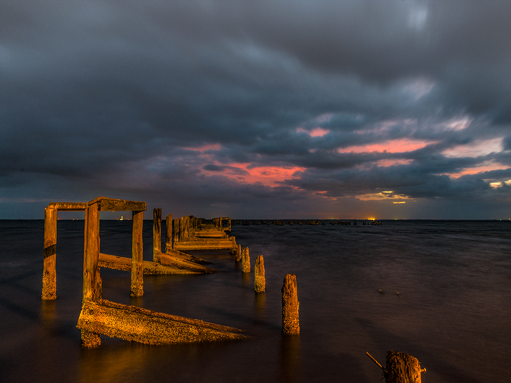
Titusville Pier was created last weekend in Titusville-Florida with the occasion of the 2018 birding and wildlife festival. I was driving by the coast line and saw this abandoned pier with a bunch of pylons. Came back the next morning before sunrise. Placed my tripod on the water and set up my Nikon D800 with the Nikkor lens 24-120 mm at 24 mm and with these settings: ISO 200, f/10 and 15 seconds exposure. The pylons are partially illuminated by the street lights. The image was corrected with additional exposure, saturation, clarity and was cropped slightly. The light in the horizon correspond to Cape Canaveral. I think there is a rocker set up right between the pylons on the left of the frame.
This round’s discussion is now closed!
10 comments posted
Quite an interesting image Isaac! The colors of the pier are especially well done and the clouds are beautifully showing off the detail along with the little bits of color that show in spots. The texture of the pier is visually interesting. The leading lines of the pier going off into the horizon are sharp and well-focused. Really some amazing colors in this shot and I even was quite amazed at how it looked when I was playing around with it as a black and white image also.
To me, it seems that the brown water loses detail against the rest of the image and it's hard to see what it represents. Posted: 02/05/2018 13:03:00
To me, it seems that the brown water loses detail against the rest of the image and it's hard to see what it represents. Posted: 02/05/2018 13:03:00
Yes David, I agree. The brownish color of the water is due to the street light also reflected in the surface of the dark water. The exposure was not long enough to smooth it more and perhaps avoid that color contamination. Posted: 02/07/2018 14:39:50
The lighting is superb and really picks out the textures on the rotting wood of the old pier. The colour of the light matches the colour you would expect from sunrise and goes well with the colour of the clouds. The brown light on the water didn't really worry me, but you could use Select>Color Range in Photoshop to pick up just that colour and then useHue/Saturation to change the colour, and Curves to give the waves more contrast. I feel that the plain dark blue/grey of the upper part of the clouds doesn't contribute a lot and could be cropped off. Posted: 02/11/2018 06:51:12
I really enjoy the rotting pier. And I think that the sky goes well with it. I agree with Guy that we don't need all of the top of the sky. And I am somewhat distracted by the tiny white building within the pier. Posted: 02/11/2018 12:57:54
Hi Isaac
The lighting on the pier really makes it stand out I love the textures on the pier and the encrusted barnacles really add to showing its age as Guy and Joe have already said I would crop the sky down to where those beautiful areas of colour start they add real interest and intensity to the image my other note the pylon in the very bottom of the picture just catches the eye and I find it a little distracting I would remove it unless you are entering it in photo travel.A very atmospheric image I really like. Posted: 02/11/2018 15:24:32
The lighting on the pier really makes it stand out I love the textures on the pier and the encrusted barnacles really add to showing its age as Guy and Joe have already said I would crop the sky down to where those beautiful areas of colour start they add real interest and intensity to the image my other note the pylon in the very bottom of the picture just catches the eye and I find it a little distracting I would remove it unless you are entering it in photo travel.A very atmospheric image I really like. Posted: 02/11/2018 15:24:32
Your suggestions were applied Posted: 02/11/2018 20:35:59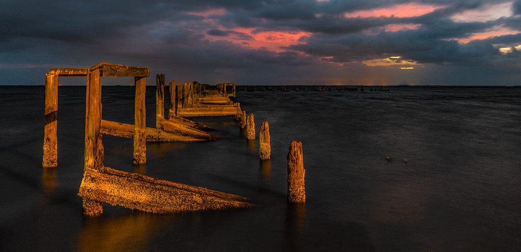
I may be biased but this makes a very good image a superb image well seen and well handled Isaac. Posted: 02/15/2018 14:37:13
Another fine capture Isaac, the pylons offer a strong leading line and their reflected color strengthens the main subject. I agree with Guy on the crop and Ian on the pylon crop. Did you you also zoom in on framing the Launch pad with the left side pylons?
Posted: 02/15/2018 10:36:17
Posted: 02/15/2018 10:36:17
Erik, not really, it just happened !!! Posted: 02/15/2018 11:28:38
Isaac has proven that sometimes we need to go back at another time when conditions are right. This image is a perfect example. It has everything going for it. Great sky, good sharp detail and the warm light has been well rendered. I'm glad someone took out the post in the foreground too. Although the area of interest is towards the left side it does not bother me that much. I'm sure you have other compositions too. Posted: 02/26/2018 13:41:41