Neal R. Thompson, M.D.
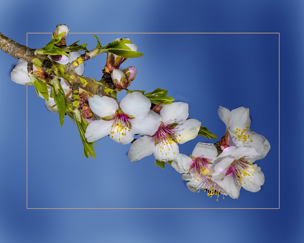
April 2021 - Blossums #3
About the Image(s)
This was taken from a tree in our yard. Multiple images were taken and worked in Helicon focus. 1/30th; f/5; iso 640 In photoshop the image was rotated and the subject selected and sharpened. The background was then selected, and a blue fill was put in. Using the burn tool allowed for the areas of darkness and light. Under a new layer a rectangular marquee was made, color selected and a stroke was added. An erasure tool removed the frame from the main subject. Some slight color painting was done on the yellow stamens.
This round’s discussion is now closed!
7 comments posted
(Groups 24 & 48 & 58)
You put a lot of work into this and it shows. However, I'm not sure if it's the flowers themselves or if some of the texture in the petals was lost in the process. Overall it's a beautiful image. Would love to have seen the original Posted: 04/01/2021 19:10:43
You did a lot of work! However, when I first saw the thumbnail, I thought it was out of focus. The larger image is much better. It's a lovely picture but I agree with Bev that some texture was lost somewhere. Posted: 04/07/2021 10:02:10
Sharp, balanced photo. Looks great! Posted: 04/07/2021 18:09:38
This sort of lifts the spirits after the long winter. Lovely feeling.Some of the petals seem washed out which is surprising given that Helicon Focus was used. Posted: 04/10/2021 14:12:27
I like that you have an odd number of full blooms. You have great colors and your work on the background really gives the impression of out of focus clouds. I'm not sure why you used Helicon instead of stopping your lens down. To me the rotation makes this appear upside down. The lighting is coming from the bottom. Flipping instead of rotating might have been better. My eye is drawn to the light bare branch on the left. A little vignette might have been added to reduce the brightness of that it. You have done a lot of work to remove the background but there seems to be some areas where the black still shows through. I am also wondering what is holding the three blooms on the right. There is also another spot where the branch is missing. I don't want to be too critical since I do like this but it seems like a little more could have been done to improve it. Posted: 04/20/2021 07:54:00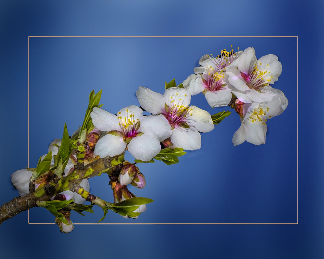
Very pretty and springy. I like the angle you used because it looks like similar branches on my peach tree. I don't think the light painting on the stamens was necessary. Nice image. Posted: 04/20/2021 15:24:31
I respect your photoshop skills. I feel soft environment around me. I agree with Mr.Dennis's composition. Posted: 04/28/2021 07:50:39