Sol Blechman
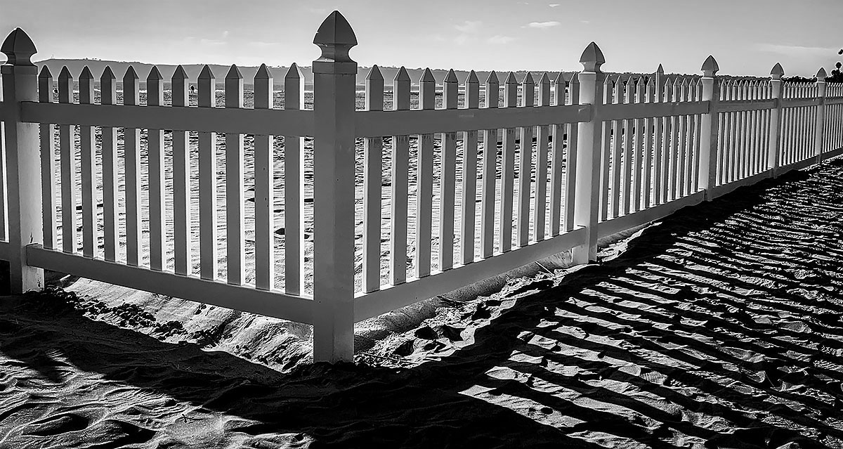
January 2021 - Fence Perspective
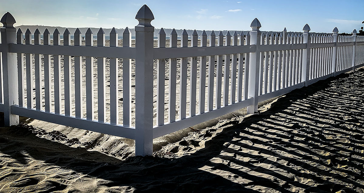
Original
About the Image(s)
Although it's rather busy, the lines, patterns and angles seem to still make an interesting image. The B&W seemed to work here a bit better. Had to play with Perspective tools in PS and that's about all the post there was.
This round’s discussion is now closed!
8 comments posted
I think it's good you went to B&W. It really brings out the shadows. I found the blue sky almost a bit distracting on the original. Posted: 01/04/2021 08:34:29
I also like the B & W version. The lines, patterns and angels in the image are perfect in the B & W version with excellent shadows. Posted: 01/10/2021 23:45:50
I agree. It is a rather interesting image and I like how the fence stops at the horizon, framed well. B&W too keeps the focus on the design. Posted: 01/12/2021 18:11:22
(Group 28)
What a lovely, simple image. I like how you dealt with the horizon line. (I'm just visiting from a different group). Posted: 01/13/2021 06:23:51
Definitely B&W. Would be a good example in a perspective tutorial. Also, good job on keeping it all in focus. My eyes would like just a little more sky at the top. I like the tonal range. Ansel would be proud. Posted: 01/17/2021 14:06:54
I agree with the B&W. You might have darkened the sky a little to show off the clouds a little more. You don't mention the lens you used but you might have tried a lower camera and moved a bit closer, if you could, to get rid of some of the textured background as well as draw even more attention to the corner post. Posted: 01/17/2021 15:28:46
Definitely a monochrome image. The tips of the picket fence hit the peripheral skyline. I'm not sure I like that. The shadows really make the image stand out. Good capture. Posted: 01/18/2021 12:48:12
(Group 32)
Great play of shadows.
I am wondering if cropping out the sky and tops of the posts would work, just to focus on the fence and shadows. Or if only the right half might concentrate on the relationship between the fence and shadows. Finally, I tried this, but the light source is screwy. Posted: 01/27/2021 00:06:56
I am wondering if cropping out the sky and tops of the posts would work, just to focus on the fence and shadows. Or if only the right half might concentrate on the relationship between the fence and shadows. Finally, I tried this, but the light source is screwy. Posted: 01/27/2021 00:06:56