Dennis Hirning, FPSA, MPSA
About the Image(s)
Canon 7D, 100-400 @ 120mm, f/8.0, 1/500 sec., ISO 125
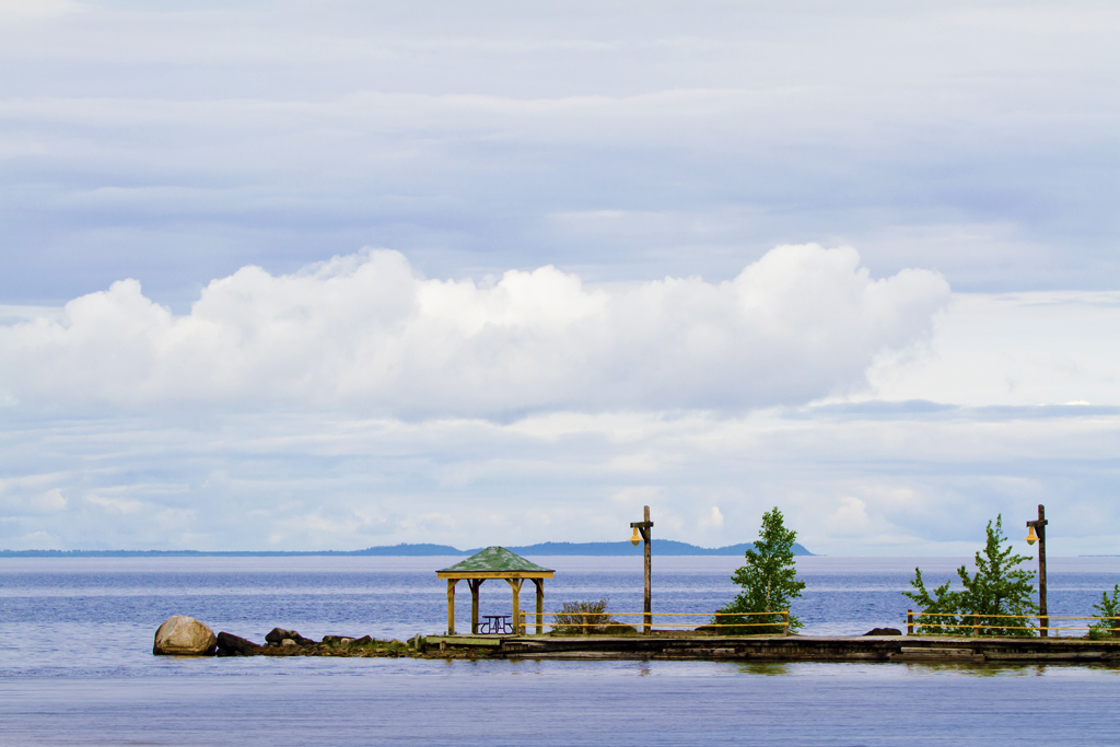
I did some brightening up on this but I'm not sure if there is enough there to make it "wall worthy". I kind of like the way the trees and dock somewhat balance the clouds. I would probably at least crop off the right most light pole and some of the clouds on top. I had this open in Photoshop for around a week before I decided it was time to quit looking at it and move on to something else. I'm open to ideas on this.
This round’s discussion is now closed!
7 comments posted
I very much like the idea of this image -- its spaces and distances. A couple of suggestions, one useable and the other not (unless you re-take): Make the sky, which so dominates the image space, more dramatic by developing its contrast and, if possible, color variety. Second, the level at which the line of distant mountains crosses the tops of the pavilion, lamppost, and tree is disturbing, at least to me. I think I would have tried to compose the image so that this background element would cut across, say, the midpoint of the pavilion etc. Posted: 07/10/2017 10:47:22
Good ideas. I might have been able to do some of those. It didn't help that everyone else was sitting in the car while I took this. I don't have any plans to go back here to retake this. Besides that, the clouds a probably gone now since this was taken almost a month ago.
Posted: 07/10/2017 16:27:26
Posted: 07/10/2017 16:27:26
It may not be "wall worthy" but it sure is inviting. I'd like to be there sometime. It have a nice pattern of repeating horizontal lines.I like the low angle where you placed the path.Those orange cables could go if you took the time. Posted: 07/10/2017 21:02:20
Very nice, serene view. Pleasant colors. Good texture in the clouds. Everything looks right here. Well done. Posted: 07/19/2017 09:58:58
Maybe not "wall worthy" but it makes me want to be there. I might crop out a little of the top of the sky, and maybe just a tad more contrast. But, otherwise, nice shot, especially considering the situation. :) Posted: 07/19/2017 11:36:52
Yes. The peninsula adds a lot to the image. I like the contrast, sharpness and color it brings to the photo. The photo I submitted is similar but yours has more bounce. Posted: 07/20/2017 16:29:10
The image lacks impact. Since the sky is so dominate, make it darker. The light areas of the wood and rocks might be further
lightened. Posted: 07/21/2017 12:54:27
lightened. Posted: 07/21/2017 12:54:27
